Even when starting Last Res0rt, one of the earliest things I did with the comic was designing a logo for it — which made sense, as even at that point there was some understanding that the show within the comic, if not the comic itself, would need a logo in the long run.
What’s followed from there is one of my most enduring images, with the logo itself having a surprising following — fans at conventions would be more than happy enough just to get merchandise with the logo on it — to the point that one fan has already has a tattoo of it!
I’m still wrapping my head around that one.
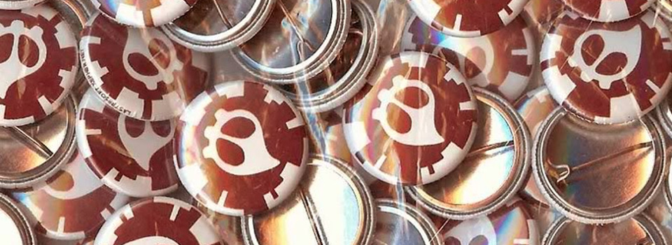
The main construction of the logo — besides the Cha0shead itself — is a series of concentric circles and arcs, with segments where certain parts jut out a little more / less than others, giving the illusion of an impact crater from ammunition, or a global city with skyscrapers jutting out.
Inspiration
Cha0s is slightly inspired by the logo for the video game series Gears of War, featuring a skull inside of a cog, and the chao from Sonic the Hedgehog, with a pointy head / skull.
Process
The original logo was drawn up in Flash MX — my primary vector software at the time — which meant the original was soon lost and I ended up retracing it over again in Illustrator.
The logo was revised in 2011 to clean up some initial “mistakes” made with that retrace, including some off-kilter arcs and a recentering of the Cha0shead within the logo.
Variants
In the webcomic, the Players Mob wears a version on their suits that consists of a cog ring around the Cha0s symbol.