Personal projects never die!
The mobile world moves fast, so a year after redesigning lastres0rt.com is enough time to go back and see what can be improved upon let again — yes, the comic itself is always going to be front and center, but the better the site’s interface is, the more likely I can convince folks at conventions to start reading the comic right away (because they can go on their smartphones and tablets!), rather than causing them to decide “Oh, I’ll do it when I get home” and losing that initial interest.
Part of the work is done as the site is still responsive (and I went through some of my rationale for that before), but issues still remain, especially when I get feedback like:
- “What is this?!” Advertising around campus (and elsewhere) still reveals that a certain level of confusion is high as to what Last Res0rt IS, before folks even go to the site (and sometimes even when they do), because the were expecting a band, or a tv show (certain military dramas aside) instead of a comic. I’m not sure how much of this is a certain level of difficulty with reaching people in general, or…
- “I don’t know what it is, but it doesn’t look like something I’d like!” There’s always that delicate balance between what people are familiar with (and won’t reject for being too weird) and what is TOO familiar (and thus looks like a “ripoff” and ends up similarly repulsive). I hate to go back to the old “furry” well, especially with the recent success of My Little Pony: Friendship is Magic proving that the right work will get past these concerns — but it has to reach a certain level of critical mass first!
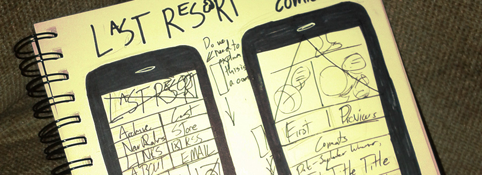
So, some changes I’m keen on making to the system:
- Improving the Comic Navigation to make larger targets for touchscreens — I’m debating whether or not “Comments” needs to be included in the same line with the navigation vs. below the navigation, even if it does tidy things up.
- Doing more with the “Title” Header — either to better explain the site or to provide some level of additional navigation / customization. This is more for the purposes of a desktop redesign vs. a mobile redesign, but since the site is responsive, we still have to consider it in light of how that might affect the mobile experience.
- Design / Branding Review — the site’s changed a bit on even a slight level in terms of how colors are arranged on the site, which parts of the site are what color, etc. — and some of that has to be re-evaluated while we’re making all these changes. The site is usable, clean, and fast-loading, but not necessarily “pretty” in the typical web-design sense. It gets the job done, and not much else.
